Continuing Education
## Warning in library(package, lib.loc = lib.loc, character.only = TRUE,
## logical.return = TRUE, : there is no package called 'plyr'
The intent of this document is to provide myself with a way of tracking the status of my progress for me Continuing Education Units (CEs) for the rest of the month of May.
It is currently 2019/05/25. I must have 20 hours of CEs by the end of this month. I hope to have a 2 day buffer in between the time that my CEs are completed and by the time that my recertification deadline is. This buffer will account for any issues that might arise during my recertification.
startDay                          <- 24
daysRemaining                     <- 31 - startDay
dayBuffer                         <- 2
numberOfCEsCompleted              <- 0
minimumNumberOfCEsRequired        <- 20
MinimumAmountOfCEsCompletedPerDay <- ceiling((minimumNumberOfCEsRequired - numberOfCEsCompleted) / (daysRemaining - dayBuffer))
The following array will be used to track my progress throughout the remaining 5 days. I must complete 4 hours each day. The values within the array will be changed as the day changes.
ActualCEsCompletedPerDay <- c(2.5, 11.75, 6.0, 0, 0)

dataFrame <- data.frame(
  Date = paste("May ",c(25:(31-2)),"th", sep=""),
  Hours = ActualCEsCompletedPerDay,
  CumulativeHours = cumsum(ActualCEsCompletedPerDay)
)
kable(dataFrame, caption="Progress")| Date | Hours | CumulativeHours |
|---|---|---|
| May 25th | 2.50 | 2.50 |
| May 26th | 11.75 | 14.25 |
| May 27th | 6.00 | 20.25 |
| May 28th | 0.00 | 20.25 |
| May 29th | 0.00 | 20.25 |
The following graph is useful in visualizing the number of hours completed. In theory, having a visualization of the amount of work that I have completed will allow me to stay motivated more easily. The X axis represents the days remaining until the deadline (minus the buffer period). The Y axis represents the number of Hours completed. The bar graph shows the number of hours completed each day, while the line graph shows the cumulative total of the number of hours completed. The horizontal line at y=4 represents the minimum amount of CEs that I must complete each day. If the bar graph shows a number lower than this value, then there is a deficit in my performance. The horizontal line at y=20 represents the total number of CEs that must be completed by the deadline. If the line graph shows a number lower than this value by the final day, then my performance is lacking and remedial CEs must be performed during the buffer days. Ideally this will not occur.
ggplot(dataFrame, aes(x=Date, y=Hours)) +
  ggtitle("Continuing Education Hour Management") +
  geom_bar(stat="identity") +
  coord_cartesian(ylim=c(0,25)) +
  geom_hline(yintercept=20) +
  geom_hline(yintercept=MinimumAmountOfCEsCompletedPerDay, linetype="dashed", color="red") +
  geom_line(aes(x=Date, y=CumulativeHours, group=1), color="green", size=2)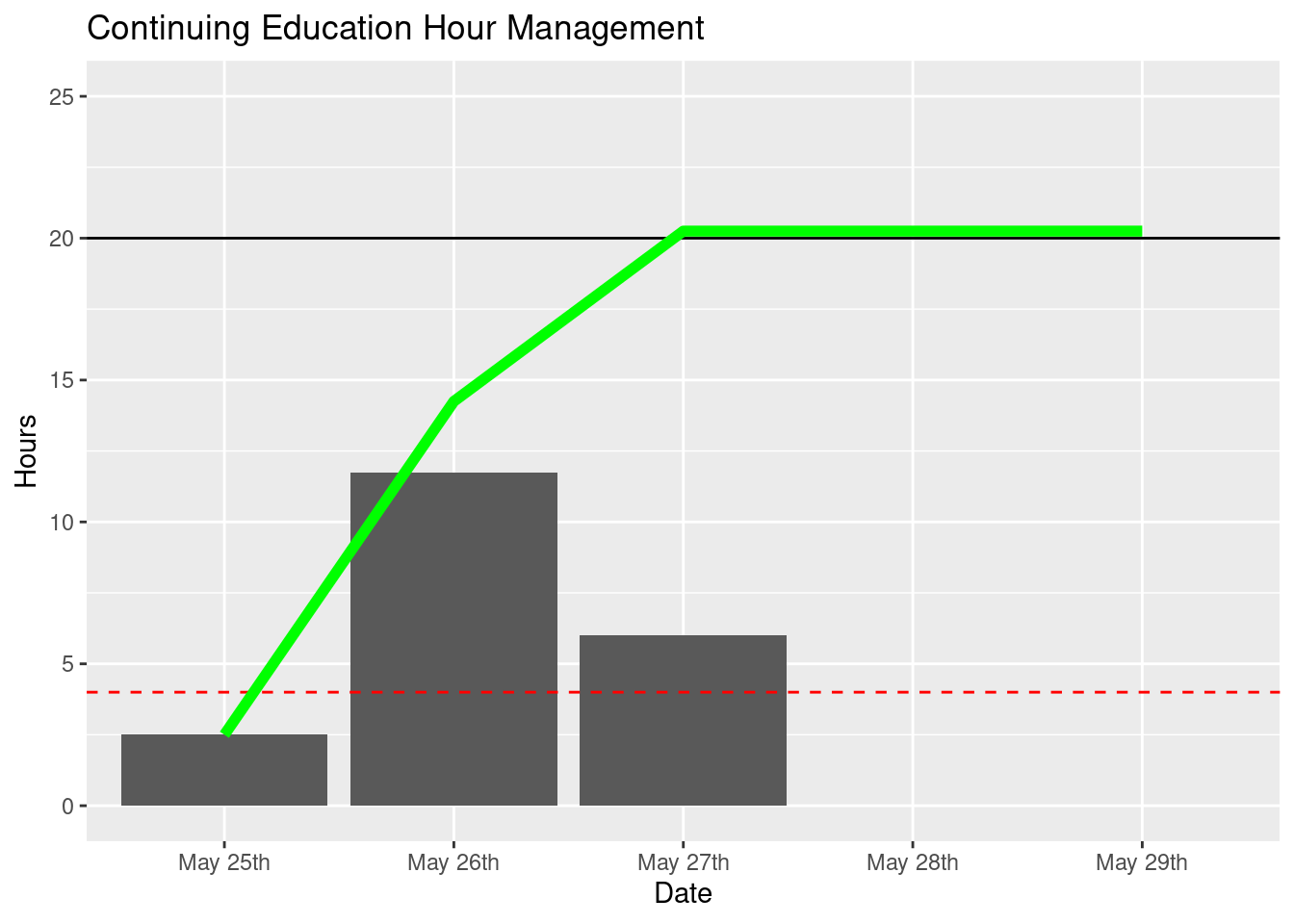
As of 2019/05/19 I have completed all of my required CEs and will be submitting my application for renewal shortly.